Adnan Khan
LinkedIn
→
Redesigning the Litmus Application
Co-led the redesign of the Litmus application to with enhanced speed, introduce new QA features, and modernize the UI. This transformation reduced preview time from 20 minutes to 6 seconds
Design Lead
Design Strategy & Vision
2023 - 24
Overview
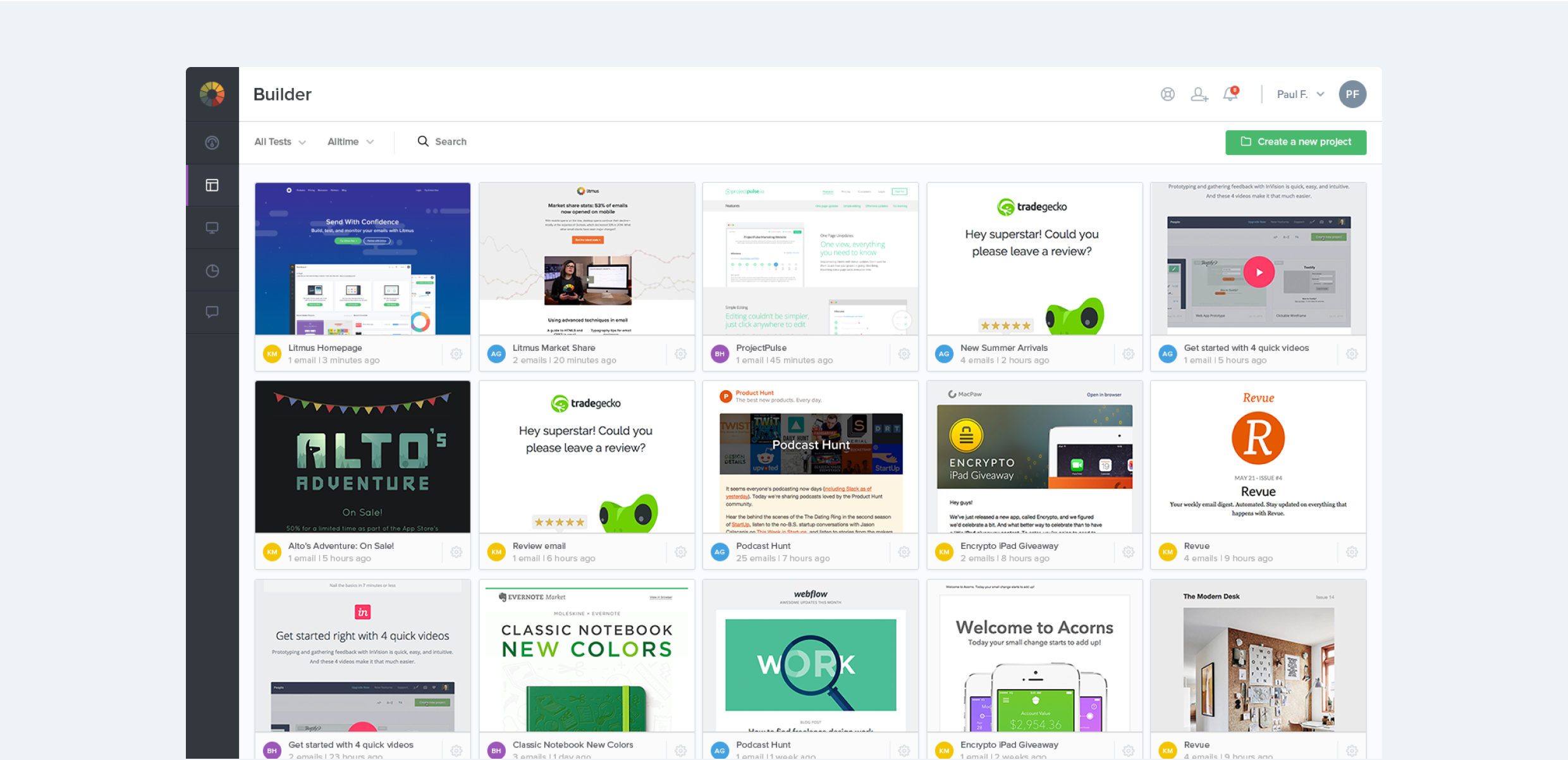
Litmus builds a suite of powerful tools for email designers, developers and marketers. In 2015, Litmus had positioned itself as a leader in email testing and tracking. One of its biggest offerings was allowing customers to render email code in over 90+ email clients such as Outlook, Apple Mail, iOS Mail and more.
I joined Litmus as the second design team member. At the time it took upto 20 minutes to render a set of email previews, this was one of the biggest customer pain point the company faced. As a result of significant investment in infrastructure and innovation, the team was able to reduce this time down to just 6 seconds (a 200x speed gain!).
This was a unique opportunity to think through new ways users could test and optimize their emails within Litmus. Significant user research had proven that customers wanted additional checks from Litmus beyond just speed improvements, including ways to optimize code, image loading speed, subject line checking etc.
The screens in this case study highlight the collaborative efforts of myself along with my Lead Designer at the time, Alan TIppins. Our team was responsible for the end-to-end solutioning including customer research, visual design, prototyping in HTML/SCSS and useability testing.
Building for a faster email testing experience
A deeper understanding was developed through extensive research into existing customer workflows, this helped not only inform testing patterns but specific pain points that could be addressed as part of the speed improvements.
- Making Litmus available to a new type of customer by innovating new ways to test, introduce new types of checks within emails beyond just previews. This would help increase overall usage and seat growth of the platform.
- Improving the existing user experience in light of the faster backend infrastructure, this would help improve retention and delight to existing users.
- Improve customer satisfaction by delivering a fresh user interface that complimented existing design trends, and is built with faster testing in mind.
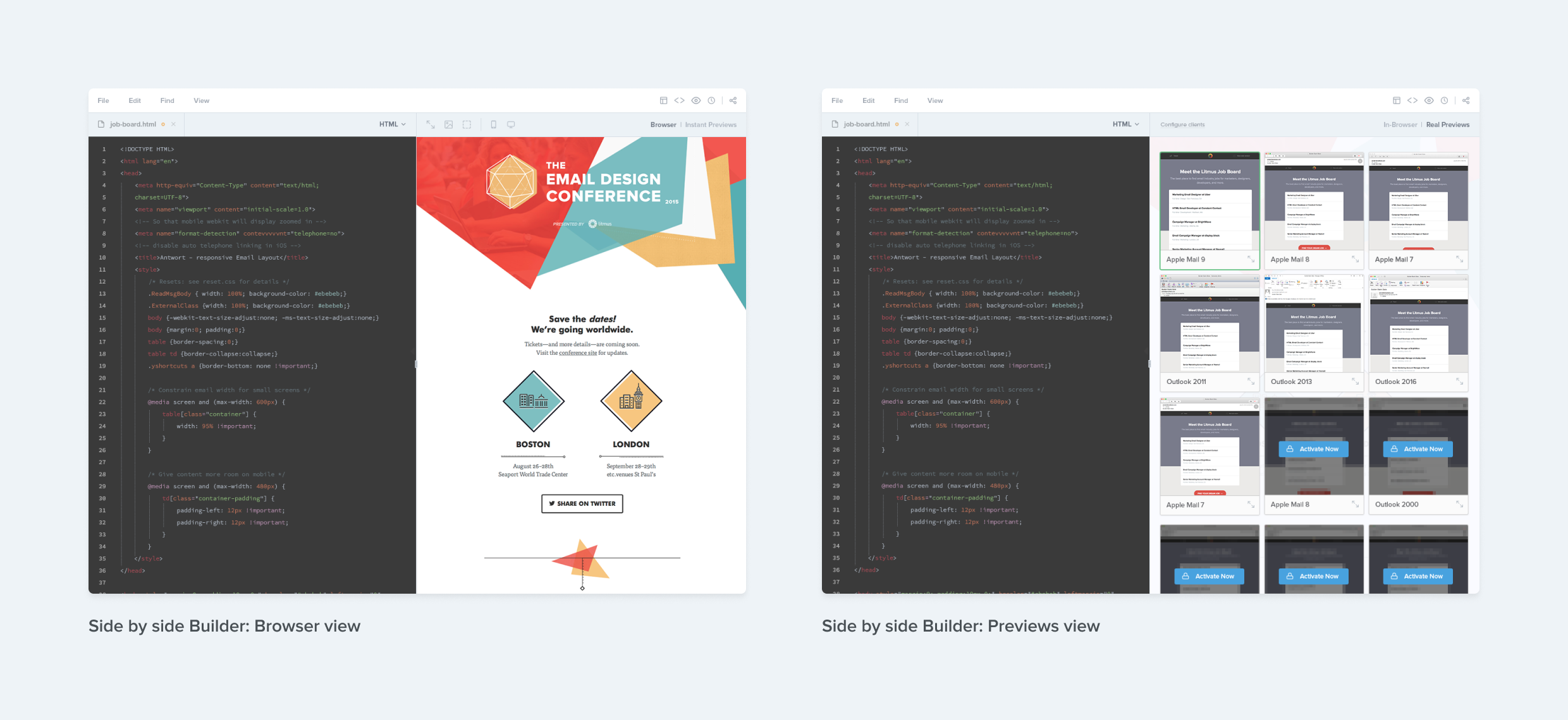
Integrating Previews into the email Builder
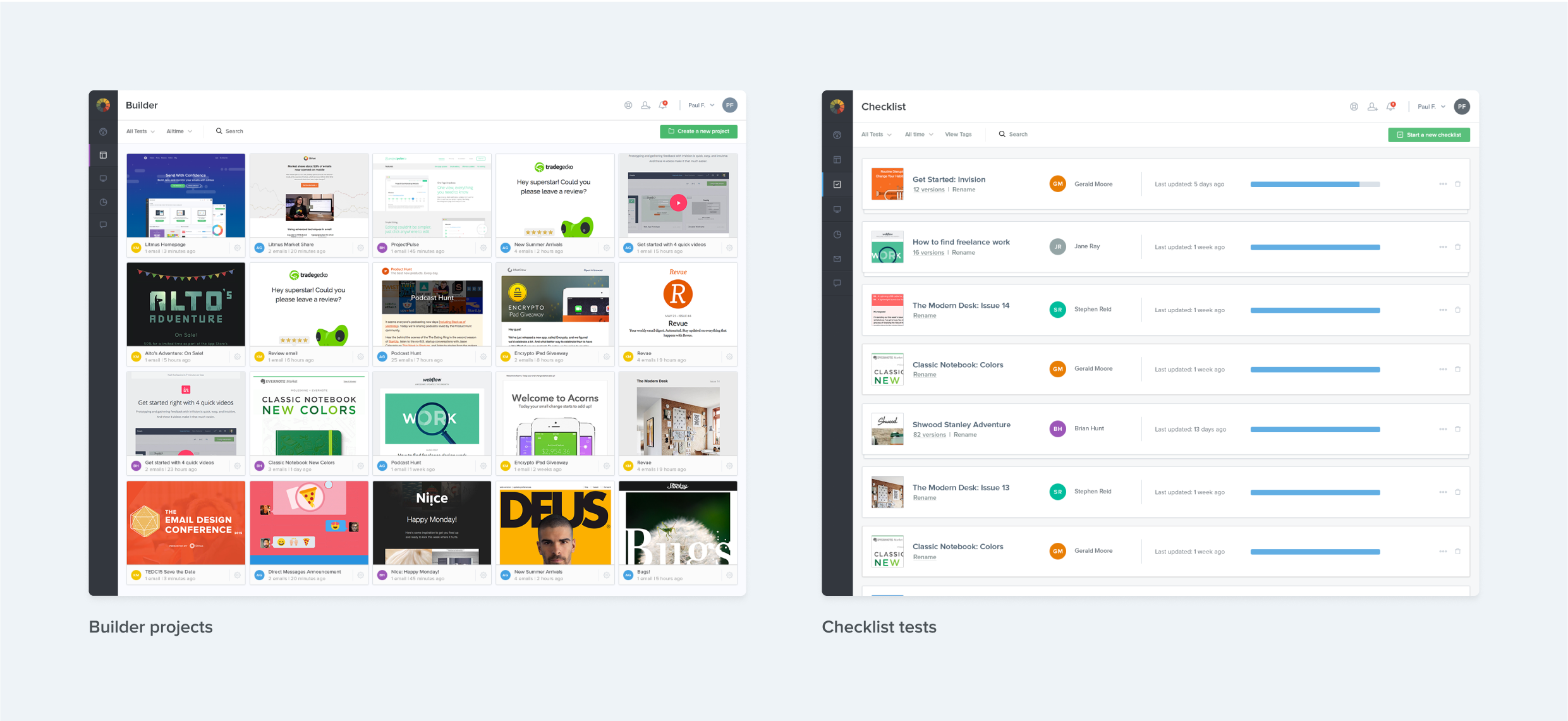
As a result of the faster previews architecture, we were able to integrate email previews directly in to the email building experience. This allowed users to switch between a browser view and a previews view. Users could even drill into a specific email client (e.g. Apple Mail 12), and test their live code within just that client.
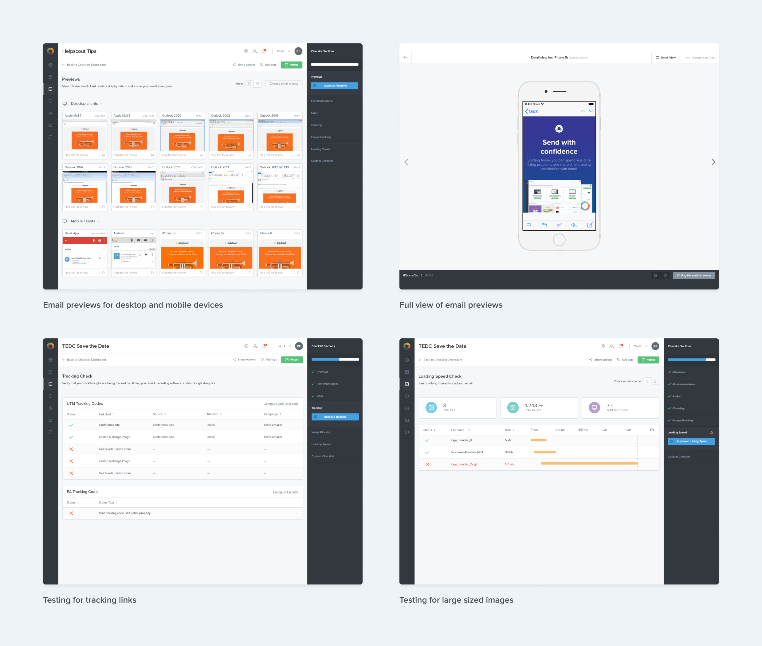
Introducing Litmus Checklist
Checklist was Litmus’ answer towards offering a QA solution, it was targeted specifically for email marketing managers who needed to run a final check before hitting the big frightening send button. Checklist would help capture critical bugs and advocated for a QA workflow, this was inline with a lot of our findings from prior research. Checklist also allowed users to tailor their workflow to add additional steps or requirements if needed.
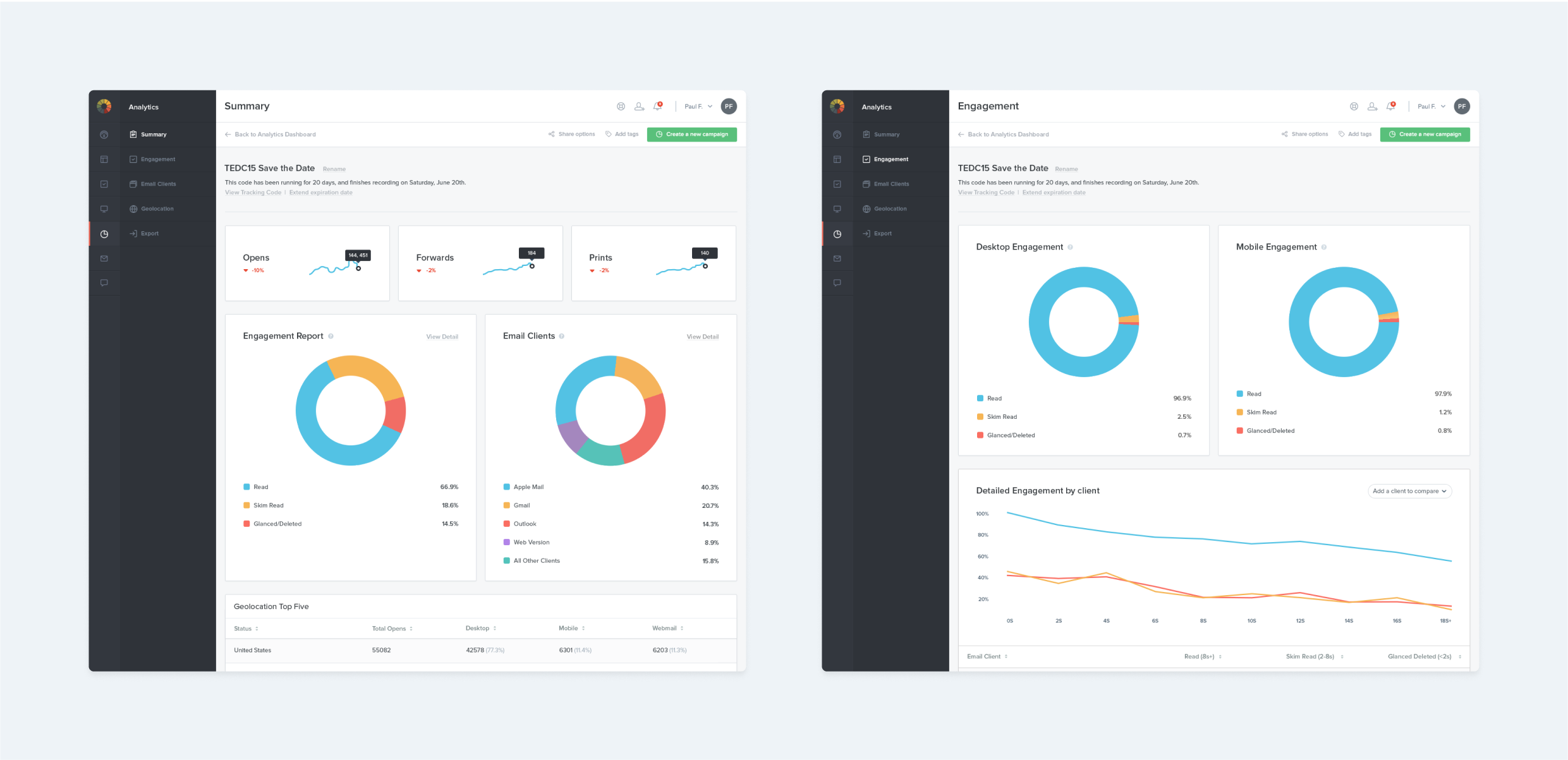
Reskinning Litmus Analytics
The last piece of the puzzle was to bring the existing Litmus Analytics experience up-to-date with the updated user interface. Litmus Analytics or better known in the industry as “pixel tracking” measures critical data relevant to an email send, such as opens and engagement. This lead to the design of a charts library that could be cohesively used across the application.
Filling the Gaps
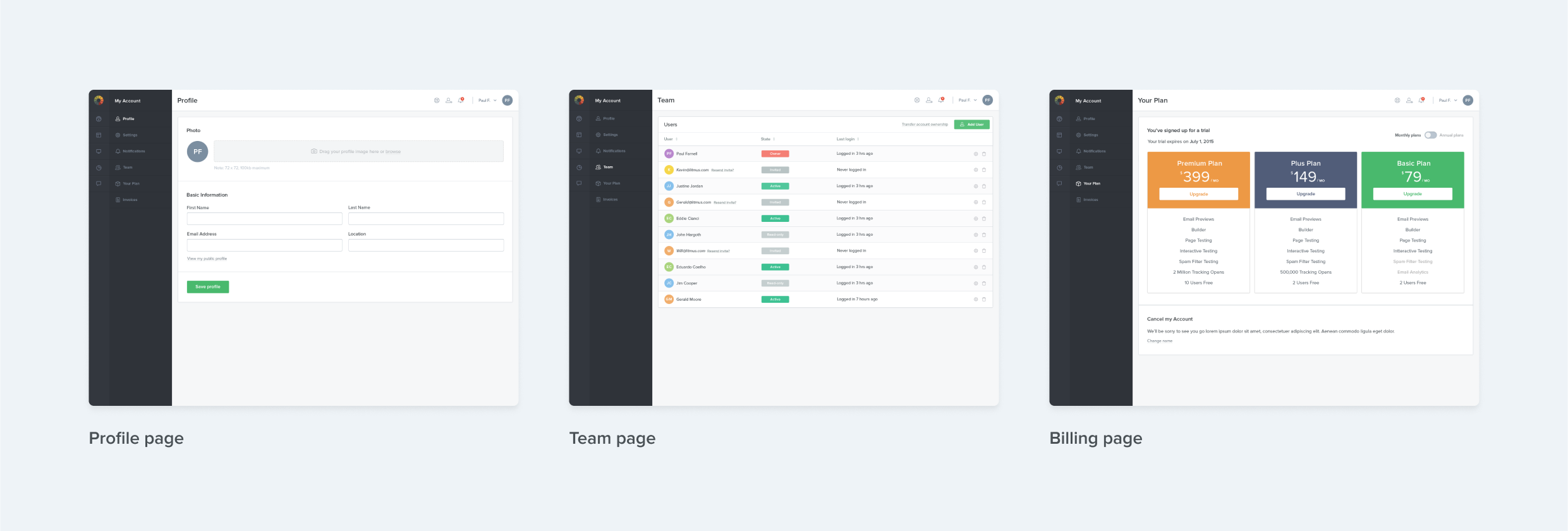
Once the new features were complete and existing features updated, it was time to focus on areas of the application that usually do not get enough design love throughout their life. As part of the redesign the settings area was brought up-to-date as well. The bigger chunk of effort was involved improving the billing experience, and building a foundation upon which future experiments to begin taking place.
Impact & Learnings
The early build of the redesigned platform was tested at Litmus Live (formerly The Email Design Conference), Litmus’ annual conference for #emailgeeks. Its one of the most popular events for email designers of the year and perfect oppertunity to collect feedback.

I’ve often made the mistake of using the word “Launch” or “Ship” for a specific feature set, where as its become clear to me that delivering value to customers in an ongoing and often tediously incremental process. While building new features are a great addon to that value metric, as designers we need to continously derive learnings to form clear next steps.
- Users loved the improvements in the speed of the platform and the reworked interface! Said this would shave hours off of their testing workflow and help send emails faster through previews integration in Builder.
- Overtime Litmus had positioned itself as a previews only company, this perception made it difficult for certain users to understand the new Checklist experience. There was an education gap that had to be bridged to make the additional tests available more impactful.
- There was a growth in net new users overtime as a result of Litmus positioning itself to new groups of users.
- The initial month of the release there was a spike in churn as a result of the new platform going live in a busy season, and users were reluctant towards learning. Figures in following months were proven to be significantly lower.
Links
- View Builder on the Litmus Website ->
- View Email Analytics on the Litmus Website ->
Built with ❤ in Figma Sites


Adnan Khan
LinkedIn
→
Redesigning the Litmus Application
Co-led the redesign of the Litmus application to with enhanced speed, introduce new QA features, and modernize the UI. This transformation reduced preview time from 20 minutes to 6 seconds
Design Lead
Design Strategy & Vision
2023 - 24
Overview
Litmus builds a suite of powerful tools for email designers, developers and marketers. In 2015, Litmus had positioned itself as a leader in email testing and tracking. One of its biggest offerings was allowing customers to render email code in over 90+ email clients such as Outlook, Apple Mail, iOS Mail and more.
I joined Litmus as the second design team member. At the time it took upto 20 minutes to render a set of email previews, this was one of the biggest customer pain point the company faced. As a result of significant investment in infrastructure and innovation, the team was able to reduce this time down to just 6 seconds (a 200x speed gain!).
This was a unique opportunity to think through new ways users could test and optimize their emails within Litmus. Significant user research had proven that customers wanted additional checks from Litmus beyond just speed improvements, including ways to optimize code, image loading speed, subject line checking etc.
The screens in this case study highlight the collaborative efforts of myself along with my Lead Designer at the time, Alan TIppins. Our team was responsible for the end-to-end solutioning including customer research, visual design, prototyping in HTML/SCSS and useability testing.
Building for a faster email testing experience
A deeper understanding was developed through extensive research into existing customer workflows, this helped not only inform testing patterns but specific pain points that could be addressed as part of the speed improvements.
- Making Litmus available to a new type of customer by innovating new ways to test, introduce new types of checks within emails beyond just previews. This would help increase overall usage and seat growth of the platform.
- Improving the existing user experience in light of the faster backend infrastructure, this would help improve retention and delight to existing users.
- Improve customer satisfaction by delivering a fresh user interface that complimented existing design trends, and is built with faster testing in mind.
Integrating Previews into the email Builder
As a result of the faster previews architecture, we were able to integrate email previews directly in to the email building experience. This allowed users to switch between a browser view and a previews view. Users could even drill into a specific email client (e.g. Apple Mail 12), and test their live code within just that client.
Introducing Litmus Checklist
Checklist was Litmus’ answer towards offering a QA solution, it was targeted specifically for email marketing managers who needed to run a final check before hitting the big frightening send button. Checklist would help capture critical bugs and advocated for a QA workflow, this was inline with a lot of our findings from prior research. Checklist also allowed users to tailor their workflow to add additional steps or requirements if needed.
Reskinning Litmus Analytics
The last piece of the puzzle was to bring the existing Litmus Analytics experience up-to-date with the updated user interface. Litmus Analytics or better known in the industry as “pixel tracking” measures critical data relevant to an email send, such as opens and engagement. This lead to the design of a charts library that could be cohesively used across the application.
Filling the Gaps
Once the new features were complete and existing features updated, it was time to focus on areas of the application that usually do not get enough design love throughout their life. As part of the redesign the settings area was brought up-to-date as well. The bigger chunk of effort was involved improving the billing experience, and building a foundation upon which future experiments to begin taking place.
Impact & Learnings
The early build of the redesigned platform was tested at Litmus Live (formerly The Email Design Conference), Litmus’ annual conference for #emailgeeks. Its one of the most popular events for email designers of the year and perfect oppertunity to collect feedback.
I’ve often made the mistake of using the word “Launch” or “Ship” for a specific feature set, where as its become clear to me that delivering value to customers in an ongoing and often tediously incremental process. While building new features are a great addon to that value metric, as designers we need to continously derive learnings to form clear next steps.
- Users loved the improvements in the speed of the platform and the reworked interface! Said this would shave hours off of their testing workflow and help send emails faster through previews integration in Builder.
- Overtime Litmus had positioned itself as a previews only company, this perception made it difficult for certain users to understand the new Checklist experience. There was an education gap that had to be bridged to make the additional tests available more impactful.
- There was a growth in net new users overtime as a result of Litmus positioning itself to new groups of users.
- The initial month of the release there was a spike in churn as a result of the new platform going live in a busy season, and users were reluctant towards learning. Figures in following months were proven to be significantly lower.
Links
- View Builder on the Litmus Website ->
- View Email Analytics on the Litmus Website ->
Built with ❤ in Figma Sites
Adnan Khan
LinkedIn
→
Redesigning the Litmus Application
Litmus reduced preview test time from 10 minutes to 6 seconds, prompting a platform redesign. I co-led this transformation, enhancing speed, adding new QA features, and modernizing the UI, resulting in a faster, more intuitive, and user-friendly experience.
Design Lead
Design Strategy & Vision
2023 - 24
Overview
Litmus builds a suite of powerful tools for email designers, developers and marketers. In 2015, Litmus had positioned itself as a leader in email testing and tracking. One of its biggest offerings was allowing customers to render email code in over 90+ email clients such as Outlook, Apple Mail, iOS Mail and more.
I joined Litmus as the second design team member. At the time it took upto 20 minutes to render a set of email previews, this was one of the biggest customer pain point the company faced. As a result of significant investment in infrastructure and innovation, the team was able to reduce this time down to just 6 seconds (a 200x speed gain!).
This was a unique opportunity to think through new ways users could test and optimize their emails within Litmus. Significant user research had proven that customers wanted additional checks from Litmus beyond just speed improvements, including ways to optimize code, image loading speed, subject line checking etc.
The screens in this case study highlight the collaborative efforts of myself along with my Lead Designer at the time, Alan TIppins. Our team was responsible for the end-to-end solutioning including customer research, visual design, prototyping in HTML/SCSS and useability testing.
Building for a faster email testing experience
A deeper understanding was developed through extensive research into existing customer workflows, this helped not only inform testing patterns but specific pain points that could be addressed as part of the speed improvements.
- Making Litmus available to a new type of customer by innovating new ways to test, introduce new types of checks within emails beyond just previews. This would help increase overall usage and seat growth of the platform.
- Improving the existing user experience in light of the faster backend infrastructure, this would help improve retention and delight to existing users.
- Improve customer satisfaction by delivering a fresh user interface that complimented existing design trends, and is built with faster testing in mind.
Integrating Previews into the email Builder
As a result of the faster previews architecture, we were able to integrate email previews directly in to the email building experience. This allowed users to switch between a browser view and a previews view. Users could even drill into a specific email client (e.g. Apple Mail 12), and test their live code within just that client.
Introducing Litmus Checklist
Checklist was Litmus’ answer towards offering a QA solution, it was targeted specifically for email marketing managers who needed to run a final check before hitting the big frightening send button. Checklist would help capture critical bugs and advocated for a QA workflow, this was inline with a lot of our findings from prior research. Checklist also allowed users to tailor their workflow to add additional steps or requirements if needed.
Reskinning Litmus Analytics
The last piece of the puzzle was to bring the existing Litmus Analytics experience up-to-date with the updated user interface. Litmus Analytics or better known in the industry as “pixel tracking” measures critical data relevant to an email send, such as opens and engagement. This lead to the design of a charts library that could be cohesively used across the application.
Filling the Gaps
Once the new features were complete and existing features updated, it was time to focus on areas of the application that usually do not get enough design love throughout their life. As part of the redesign the settings area was brought up-to-date as well. The bigger chunk of effort was involved improving the billing experience, and building a foundation upon which future experiments to begin taking place.
Impact & Learnings
The early build of the redesigned platform was tested at Litmus Live (formerly The Email Design Conference), Litmus’ annual conference for #emailgeeks. Its one of the most popular events for email designers of the year and perfect oppertunity to collect feedback.
I’ve often made the mistake of using the word “Launch” or “Ship” for a specific feature set, where as its become clear to me that delivering value to customers in an ongoing and often tediously incremental process. While building new features are a great addon to that value metric, as designers we need to continously derive learnings to form clear next steps.
- Users loved the improvements in the speed of the platform and the reworked interface! Said this would shave hours off of their testing workflow and help send emails faster through previews integration in Builder.
- Overtime Litmus had positioned itself as a previews only company, this perception made it difficult for certain users to understand the new Checklist experience. There was an education gap that had to be bridged to make the additional tests available more impactful.
- There was a growth in net new users overtime as a result of Litmus positioning itself to new groups of users.
- The initial month of the release there was a spike in churn as a result of the new platform going live in a busy season, and users were reluctant towards learning. Figures in following months were proven to be significantly lower.
Built with ❤ in Figma Sites